
Redesigning Senzary's Nanotrack Dashboard for Mobile
I led Senzary's mobile dashboard redesign, reducing company shipping downtime by 13%.
Summary
Senzary monitors supply chain data through their Nanotrack Service - sensors that communicate real-time data to clients.
I led the end to end design direction of the redesign including strategy and prototyping.
Team
Eric Schummer — CEO
Girish Dadheech— CTO
Priya Morf — Product Designer
Asmaa Gass — Product Designer
Sarah Saberi — Product Designer
Timeline & Status
4 Months, Shipped
Highlights
Supply Chain Data Monitoring
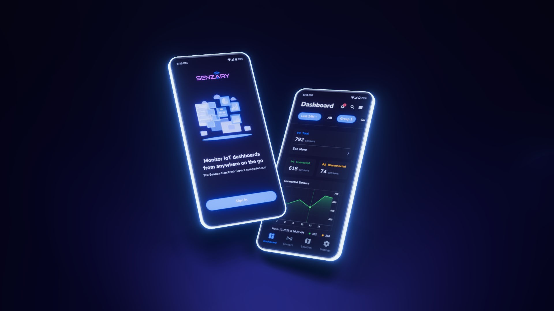
Sign in motion concept
Mobile homepage and dashboard
Core components

Dashboard showcase
Marketing concept
Context
Senzary's Nanotrack Service monitors product health in a supply chain - in this case, cold chain management. Here's how the service works:
1.
Sensors attached to product
Each shipment has a sensor tag attached to monitor product health.
2.
Sensors send live data
Product health is tracked, and the data is sent to clients on a real time basis.
3.
Dashboard updates
Clients receive data about product health and sensor status.
Current Dashboard
Senzary's current dashboard for tracking data feels dated and cluttered. The design lacks clarity and focus, slowing down daily operations.

Dashboard showcase
Clients need to quickly scan and find relevant information. The dashboard is also not mobile friendly, making it difficult to navigate on the go.

Dashboard showcase
The transition to mobile aims to provide a seamless experience that accommodates clients on the move.
Challenges
Unexpected difficulties
Throughout the redesign process our team collaborated closely with the CTO who unexpectedly departed the company towards the end of the redesign process.
We re-verified design goals and technical specifications with the remaining stakeholders to stay on course.
important note
The CTO departed the company unexpectedly, leaving a gap in project oversight during the final design stages.
the Problem
Redesign goals
The core of Senzary's Nanotrack system is its utility in presenting real-time data. The original design had issues with identifying critical information, navigating the dashboard, and overall low visual fidelity.
The Challenge
Redesign the dashboard for a mobile platform, ensuring it clearly displays relevant information to clients.
strategy
Structuring the data
The dashboard can be broken down into four main sections for displaying sensor metrics. The goal here is to present these sections and the data they contain in a way that is relevant and clear.

1
Total sensors in a given group
2
Groups of sensors under a client
3
List of sensors within a selected group, and their status/metrics
4
Tracking metrics including location, temperature, and others
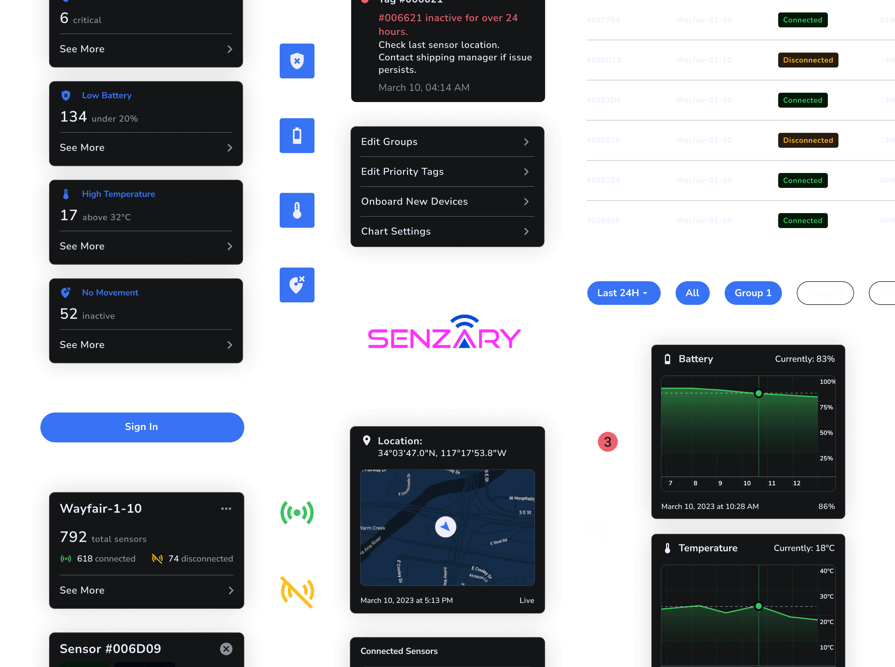
Sensor status
Clients need an overview of sensors, showing the total number of sensors in a group and the number of connected and disconnected sensors.
Connected Sensors
Sensors are healthy and connected to the nanotrack network, sending real time information and data.
Disconnected Sensors
Sensors are offline from the nanotrack network, data is not being updated or sent.
Critical conditions
Four key metrics are tracked, and sensors in critical condition are brought to attention on the dashboard home screen. Highlighting these conditions ensures that clients can take prompt action to address any issues.
Breaches
Sensor data indicates that something is outside of the expected or safe parameters
Battery Life
Sensor battery is at or below 20%. Sensor requires charging or battery change.
Temperature
Temperature measurements rise or fall beyond a specified temperature.
Movement
Lack of movement for over a certain amount of time, or irregular movement.
Organizing the data
We took a top-down approach to the redesign. Starting with an overview of sensors and key metrics, clients are alerted to general information about their operations.
Data can be examined in greater detail to pinpoint exact areas that require attention.
Desktop dashboard
What is important? What is relevant?
Overwhelmed with information
Redesign
High level overview to granular detail
Information broken down as needed
Redesign structure
Key sensor metrics are organized top-down when clients open the dashboard. From there, detailed information about specific sensors and groups can be accessed to track shipment data.

Navigation of entire mobile dashboard
Organization
Redesigned dashboard
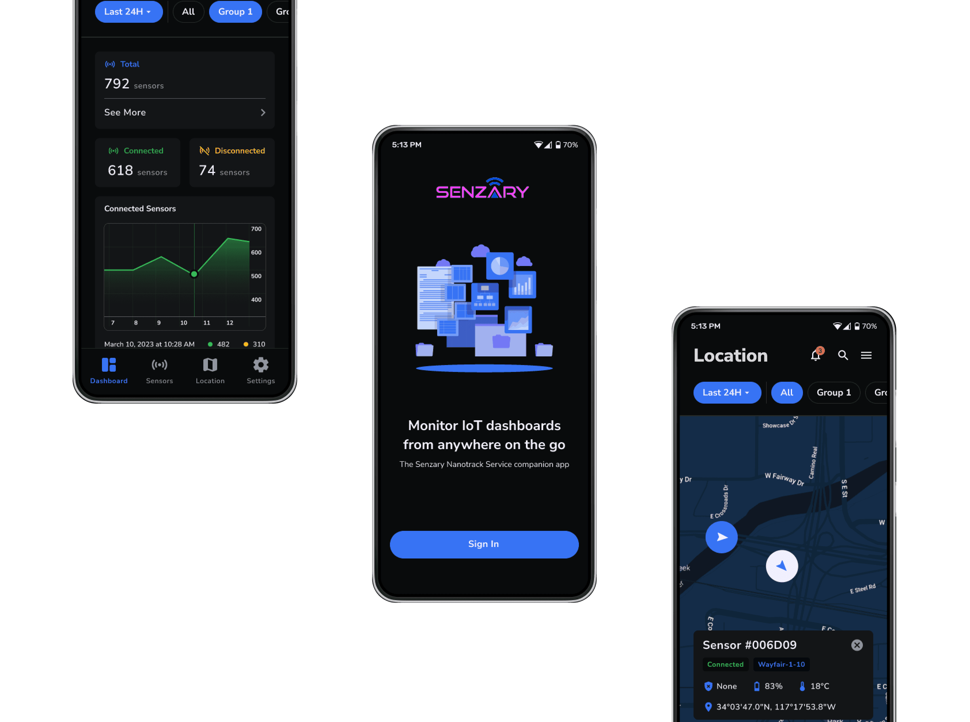
The dashboard provides a holistic view of sensor conditions, with filters for time and groups. Information is organized in a hierarchical fashion beginning with a broad overview into a more detailed look.
1
Total sensors and disconnected and connected sensors
2
Chart overtime displaying overall sensor connection data
3
Key metrics of breaches, battery, temperature, and movement
Sensor groups
Instead of having sensor groups on the main dashboard cluttering the overview, sensors groups are in a dedicated section for a more detailed approach.
1
Group information showing total sensors and connection/disconnection status
2
List of sensors within a group with detailed metrics
Individual sensor
Individual sensors are accessed through groups, and contain sensor specific data. This approach organizes information in a way that is relevant to each client's needs.
1
Sensor status showing connection state and affiliated group
2
Live map of sensor location
3
Charts displaying sensor battery life and temperature
Clients can also view a live map overview of all their sensors/groups. Tapping into a sensor brings it into the individual sensor screen giving ease of access and different ways to track sensor metrics.
1
Sensor status and ID showing connection state and affiliated group
2
Sensor metrics from live tracking displayed on card
Results
Impact and Takeaways
My time consluting at Senzary concluded after the initial design hand off. Senzary witnessed significant success with the Nanotrack services redesign, and post launch results showed a significant improvement in operational efficiency.
post launch impact
Redesigned mobile dashboard leading to 13% reduction in shipping downtime
Takeaways:
Working in an Unfamiliar Field
While working in an unfamiliar technical field, ask questions and understand the scope at hand to effectively design products.
Navigating Project Challenges
Projects will have unexpected changes, such as the departure of an important stakeholder. Maintaining a consistent design process and clear communication with remaining stakeholders ensures the project stays on track.
Redesigning with Purpose
Identify and structure current design issues by breaking them down into solvable parts. Focus on creating goal oriented solutions to successfully improve the product.
