Support SF Schools
I led the end-to-end design process of a platform connecting SF residents with local public schools.
Summary
Support SF Schools is a platform that connects residents with public schools in SF for volunteering and donations opportunities.
I was responsible for designing interactions and the exploration process. I also led design on our visual language.
Currently in Beta, we are collaborating with 122 public schools in San Francisco.
Team
Julia Gitis — Project Manager
Brandon Cruz-Youll — Tech Lead
Nick Visutsithiwong — Software Engineer
Jackson Tran — Software Engineer
Emi Fogg — UX Researcher
Amara Mir — UX Researcher
James Davis — Product Designer
Robby Taine — Data Analyst
Timeline & Status
May 2023 - Present, In Beta
Highlights
Helping volunteers and donors connect with SF public schools
Hero page motion concept

Explore schools in the city and find opportunities to help
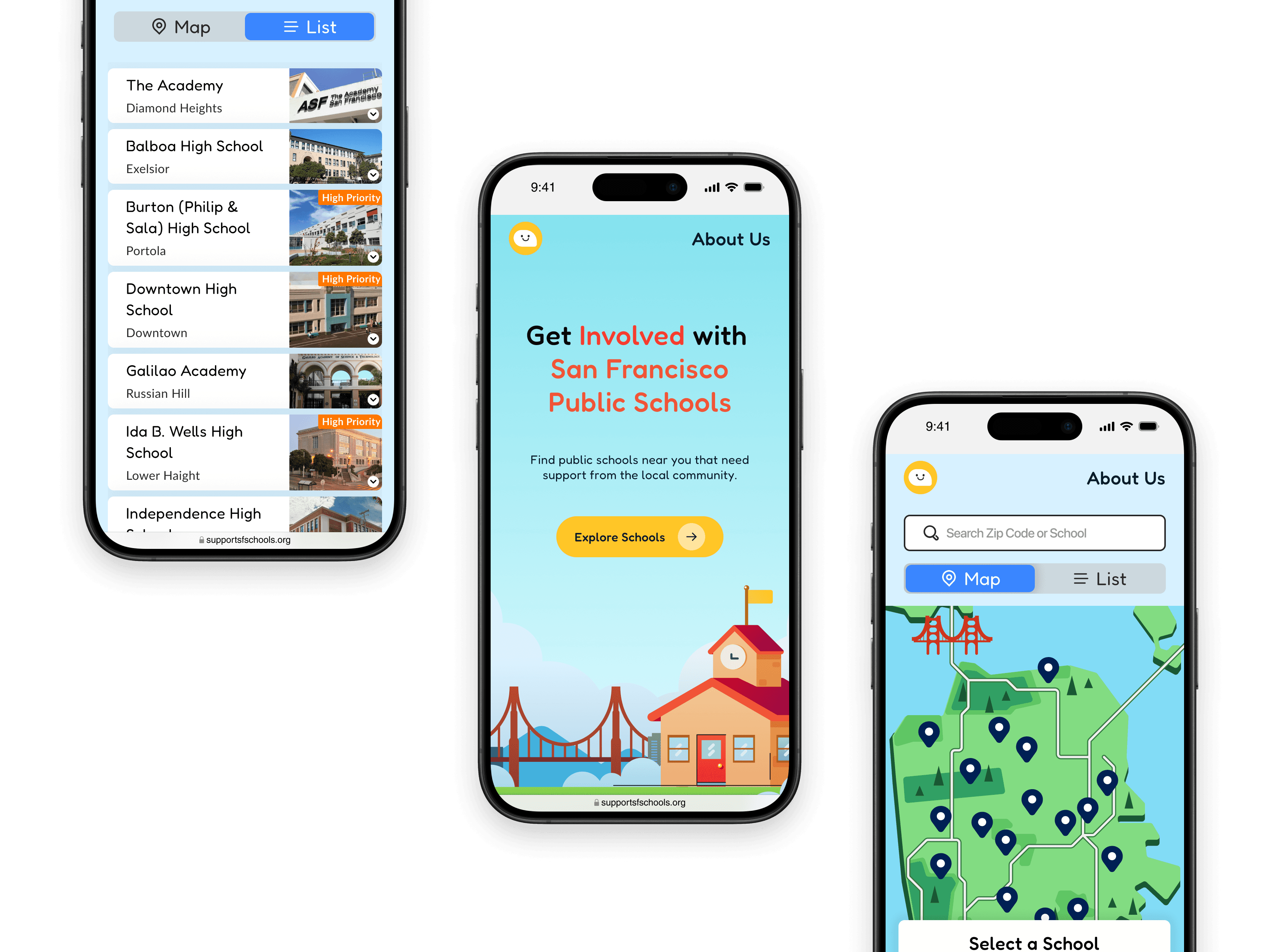
Mobile experience

Map showcase
Context
What's the volunteering and donation process like?
It's no secret that public schools are underfunded and understaffed. In early 2023, our user research team interviewed SF residents and school administrators about their experiences supporting local public schools through volunteering and donating.
Supporting schools isn't a straightforward process
Speaking with SF residents who had volunteered and donated in the past revealed frustrations in the process for supporting schools.

Responses from SF residents interested in helping local schools
What are the main issues?
Through these conversations, we identified key themes and needs across the volunteering and donation experience.
Information Gaps
Volunteers and donors find the process confusing and time-consuming due to poor communication and trouble finding school specific information.
Administrative Burden
Schools are often overwhelmed, leaving little time to organize volunteers or handle donations.
Donation Transparency
Donors want more information on how their contributions are used to benefit the student body.
Administrative issues, poor communication, and unclear information often get in the way of people interested in helping, while those who have volunteered found the process unorganized and time-consuming.
the Problem
How do we help volunteers and donors find opportunities more efficiently?
While many platforms for volunteering and donating to schools existed, they didn't focus on continuous support. We identified a gap for those wanting to connect with and support their local public schools but didn't know how.
The Challenge
Design a platform from that connects volunteers and donors directly with local schools, enabling them to work together more closely and effectively.
approach
Figuring out the best way to present opportunities
Our team took a mobile first approach with plans to design for larger devices as we figured out essential features.
Designing a simple flow
Initially the challenge seemed simple enough: ask if users want to volunteer or donate, then show them relevant opportunities.

1
Choose between volunteering or donating
2
Volunteer opportunities to browse events/projects to sign up for
3
Donation projects sourced from teachers
Turns out it's not that simple
Feedback from potential users made us realize that the experience was confusing, and lacked proper context on how the platform worked.
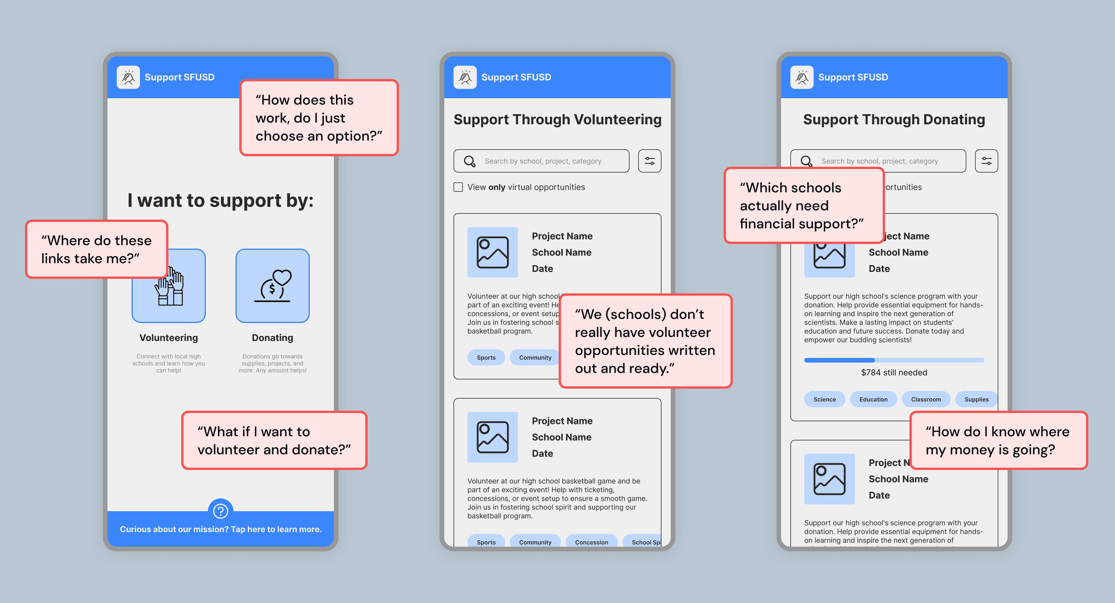
Additionally, while speaking with school administrators, the research team found that schools lack readily available volunteer opportunities, preferring to have a pool of prospective volunteers to contact as needed.
Who are we?
No clear information about our organization or the platform's purpose and use.
Volunteer opportunities
Schools often lack organized volunteer opportunities and prefer contacting prospective volunteers as needed.
Path of false choice
Initial options with little context leading to similar screens is redundant and confusing.
Which schools are underfunded?
Insufficient information about the schools led to a lack of trust and a lower inclination to support.
Issues in our current user flow
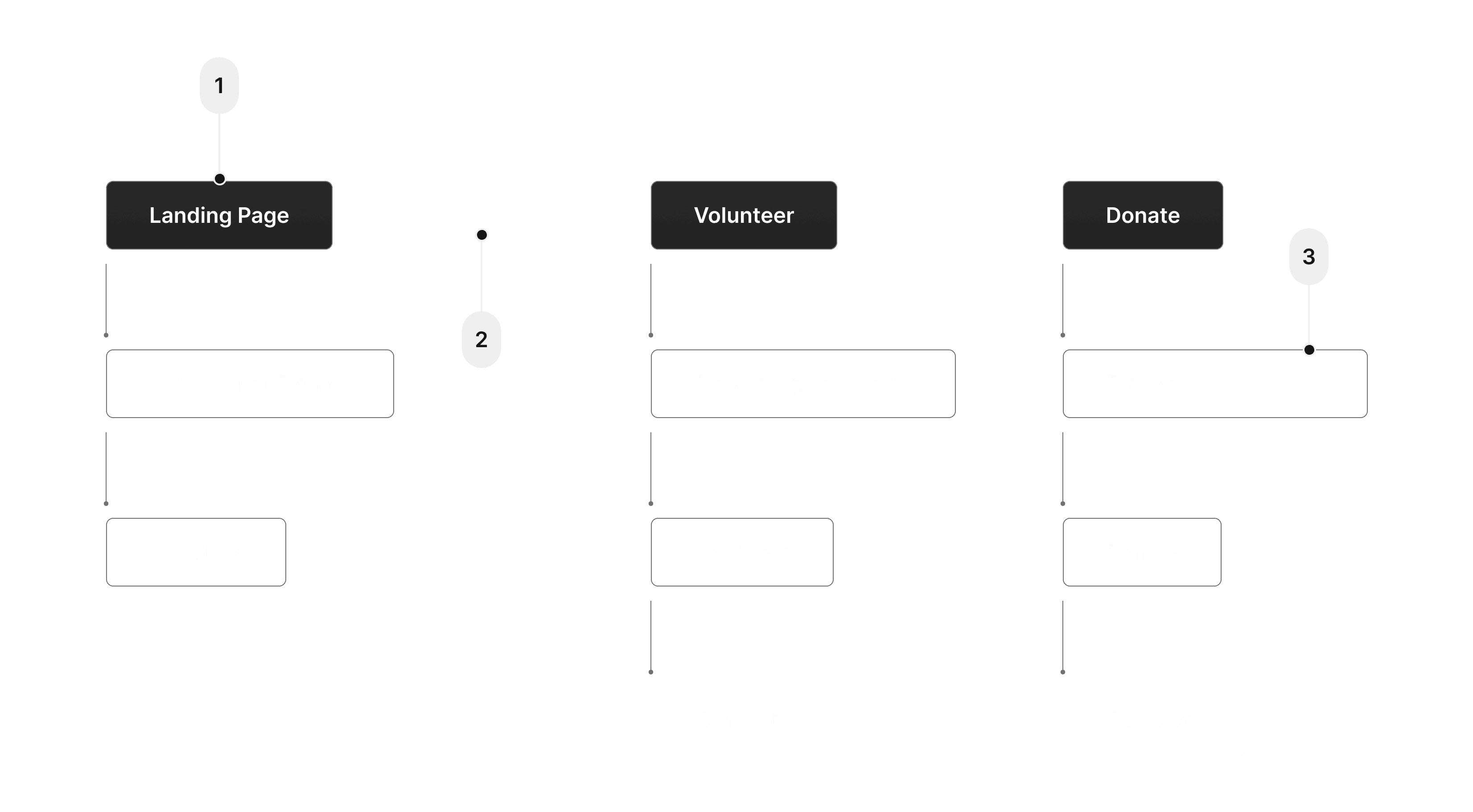
Unsure of what to do and feeling stuck in the design process, we decided to critique our current user flow and analyze opportunities for improvement based on user feedback.
1
No context about who we are as an organization and what this platform helps accomplish
2
These options lead to pretty much the same screen, so why are they separate?
3
Not enough information about the school leading to a lack of trust and less inclination to support
We realized that volunteering and donating serve as our success metrics - instead of opening with having users choose from one of the two, a better approach would be to focus on connecting users to a school they want to support.
Revising to a school first approach
So how do we connect users to schools? We reworked our user flow to open with a map and list of the SF school district for users to explore and find schools of interest.
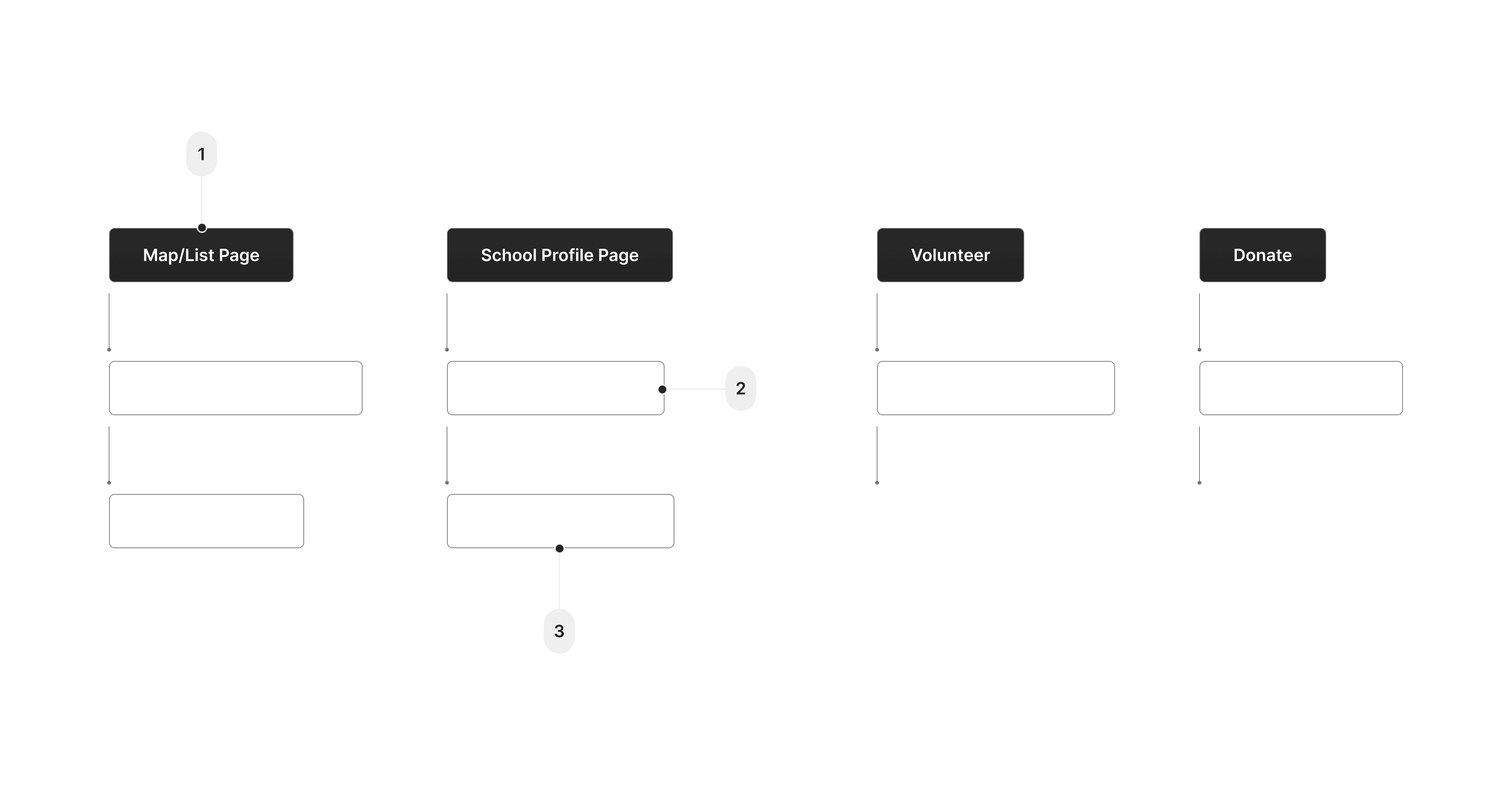
1
Map/List page to explore nearby schools - grounds the user location wise
2
Information such as graduation rates, PTSA budget, and ELL (English-language learner)
3
Volunteer and donate buttons are now on the school page, making actions school-specific
From the map and list, users choose a school and go to its school profile page where they can then choose to volunteer and/or donate by filling out a volunteer form or going through the school's preferred donation method.
The school exploration process
The goal of the revised designs was to encourage users to explore schools that fit their volunteering and donation interests. Search functions and filtering metrics help in the school exploration process before deciding to take action.
1
Tap on pins to explore schools in the SFUSD
2
Toggle between map and list page
3
Volunteer and donation options on school profile page
User Feedback
We took our designs and conducted another round of user testing, tasking users with the goal of volunteering or donating at a specific school.
Streamlined process
Clear, straightforward information puts everything in one place, making it easier to volunteer and donate.
Schools visualized
While there was initial confusion on how to use the map, users appreciated being able to explore local schools based on their location.
Visual appeal
Users found the graphics and presentation of the map fun and playful.
How does this work?
Users were initially confused by what to do with the map page. Not enough instruction on the platform's usage.
Clarify map/list toggle
Users were confused about the toggle button. Ensure it's clear for easier navigation.
What do these metrics mean?
FRL, ELL, PTSA, what do these acronyms stand for, and why are they important?
Feedback from the users centered around clarifying interactions, information, and providing more context. The reception to the experience of exploring schools and opportunities was promising, and was a step in the right direction.
iterations
Refining the experience
Feeling confident in the school exploration process, I iterated and expanded on the feedback we received.
Most of the iterations involved providing context around the platform itself, and simplifying existing interactions.
1
Hero Page briefly explaining the platform's usage
2
Integrating onboarding copy into the core experience
3
Redesigned toggle to match mental model of switching between two states
4
Reorganized based on user feedback for clearer school information
Introducing the platform with a hero page
To address the need for context and instruction, I designed a hero page with actionable information to guide users as they first arrive on our platform.

1
Initial illustration and copy listing out step by step instructions
2
Simplified illustration and enhanced colors, instructions integrated into a single paragraph
3
Simplified copy to highlight main action
Establishing a visual style
Visually I wanted to evoke an illustrated experience blending the city and education, with something that felt warm and inviting rather than overly bureaucratic or clinical.

Providing context to the map
While reception to the map's visuals were positive, users were initially confused about how to interact with the map. Simplifying interactions and integrating instructions helped improve usability.
Original
Redesign
To optimize for screen real estate on mobile, I utilized the school card to display instructions during the empty state.
Original card closeup
Nice visual experience of exploring schools
Lack of clear instructions on how this screen works
Unclear what metric filters stand for, and what they measure
Redesign card closeup
Improved visual contrast of interactable elements vs map
Integrated onboarding copy into the core experience
Metrics moved to school profile page to minimize information overload
Redesigning the toggle and improving screen economy
Users were either confused about the function of the toggle due to its appearance, or ignored it all together. The filter metrics we initially had also caused confusion for users due to the unexplained acronyms and what they measured.
Original
Redesign
I redesigned the toggle to show both possible views, and provided a clearer interaction. We also decided to move metrics to the school profile page (more on that below).
Original toggle closeup
Unclear function — is it a button? A label?
Easy to miss, visibility is poor
Redesign toggle closeup
Clearly labelled options and affordance for interaction
Simplify screen layout for visibility
what's changed since then?
We expanded to 122 public schools and replaced he map/list toggle with a side by side map + list view for larger screens (the toggle is still used on mobile devices).
The acronym-heavy filters (FRL, ELL, PTSA) were replaced with school filters (Elementary/Middle/High), and a Priority filter highlighting schools that need the most support.
Smarter filtering as we scaled
Growing to 122 schools meant our original filters couldn't keep up. We replaced the acronym heavy filters (FRL, ELL, PTSA) with plain school level filters(Elementary, Middle, High) plus a new Priority filter that shows schools needing the most support.
On the map, individual pins were also grouped into clusters, keeping dense areas of the city readable instead of cluttered.

1
Updated map view for mobile.
2
Tapping the filter icon opens different filtering options.
3
A brief explanation of high priority.

1
Clicking on a school card highlights the school's location on the map.
2
Filtering by different school levels and priority.
3
Clustering large groups of schools to reduce visual clutter.
Feedback on the school profile page centered around the excessive text. Adding more visuals and editing the copy helped highlight the school's personality while keeping things readable. The filtering metrics were also moved to the profile page as a way to school-specific statistics.

Original
Unclear what acronyms on the stats mean
Hard to scan — too much text
Redesign
Stats written out, organized to be scannable
Copy update for readability
Updated with visuals to promote school's presence

Platform foundations
The foundational shape of the platform
This isn't a finished product, it's the foundation the rest of the platform is built on. As the project continues in Beta, individual screens have evolved past what's shown here, but this represents the core shape of the experience.
Full experience flow


School selection

Map and List toggle

Volunteer section

Donation section
what's changed since then?
This summer before the school year started we began a redesign of the homepage separate from the exploration flow above.
Homepage redesign currently in progress
The prototype below is actively under construction, not a finished product. It adds three things the original homepage never had: a mission section to build trust before asking for action, a clear explanation of our process, and featured volunteer opportunities based on availability.
future
Impact and Takeaways
What started as a pilot with 17 SF public high schools has grown to 122 schools across SFUSD, spanning elementary, middle, and high schools. Beyond the platform itself, we've presented the project at SF Civic Tech's live event at GitHub's SF office and continued building relationships with school administrators and community organizations to grow awareness of the platform.
MVP Launch
We are currently collaborating with 122 SF public schools to gather information and increase awareness, with plans to expand coverage across all 121 public schools in SFUSD.
Takeaways:
Early engagement with partners
Speaking with volunteers, donors, school administration, and other organizations from the start helped the project grow realistically, providing valuable information and identifying constraints.
Work within constraints
Address administrative hurdles, user preferences, and resource limitations by building solutions that consider different approaches and account for edge cases.
Simplicity with context
Strive for a balance between simplicity and context. While simplifying the platform, ensure enough context is provided for an intuitive user experience that helps users achieve their goals.
Mission in mind
Keep the objective of connecting users with schools at the forefront. Fostering that connection is important in our project's goal of community supported education.